It all started as a late night idea.
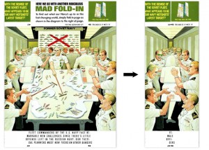
Fold-Ins. Like from Mad Magazine.
To back up a bit, I was in the middle of assembling my thoughts about just what this website should be (a place to share my creative interests and professional projects). Now, I love making digital things, but to really get inside a project I like to think about it’s physical manifestation. And so, my head loaded up with all of these ideas and descriptions about what it is that I do, Al Jaffee’s inside back-covers for Mad magazine floated into my brain.
What I love about these combinations of carefully composed images and words is that Jaffee gives each reader of the magazine the power to play magician. There’s a riddle, both literally in the form of the question asked in the upper left corner, but also in the form of the text and the image below that the reader knows contain an illustrated answer to the question. The knowledge that the answer is trapped inside this page is absolutely alluring – you have all of the tools and information given to solve this puzzle. And, with a few folds of the page, you have unlocked a secret image and answered the riddle. You have done a bit of magic, transforming one thing into another.
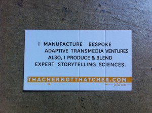
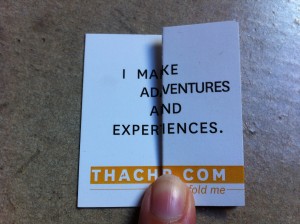
The thought that struck me that night: what about a fold-in business card to celebrate thachr.com? On the surface, it made sense: use the card to tell people what I do, by allowing them to discover it. It’s a participatory business card.
In practice, there were several considerations:
- There’s less area on a business card than a magazine page. My text (the idea of using an image was discarded relatively quickly) would have to be much shorter and couldn’t rely on as many of the tricks that Jaffee uses to make his text read so smoothly in it’s pre-folded state.
- What constitutes the right number of cues for how to interact with this object? Jaffee’s fold-ins use illustrated instructions. Do I want that level of instruction on the card?
- What should the text read before the card is folded? If I give you a card and you never fold it, is that going to be okay?
- Does the folding change the meaning of both sides of the card, or just one?
- Will I be able to print these on my budget with enough precision that they’ll ‘work’?
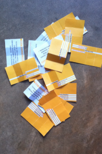
Getting to a finished design meant grappling with all of these questions. It meant many versions tried and discarded. It meant talking to various printers about the best way to score these for easy of folding, but without making them into floppy cards that don’t hold together. It meant making friends with all of the wildcard settings on the dictionary search so that I could fine tune the length of each line and find the best words for my expanded version. It meant writing samples like this just for fun:
I MANAGE TO PERFORM KARAOKE
ADVISORY SERVICES. TRY DENTURES
AQUIRED THROUGH VAGABOND
EXPERIMENTAL BACK ROOM SEQUENCES.
I MAINLY PREFER ARTICHOKE
ADVOCACY & DISLIKE INDENTURES
ABOVE LETTERS THAT END
EXPERIMENTAL FREEFORM SENTENCES.
All in all, I’m pretty happy with the results. In retrospect, I could have used a slightly lighter weight stock, making them easier to line up when folded. The scoring worked as planned and although the stock is thick, it’s pretty easy to understand where to fold and make the folds where they should be. The scoring and text did come back from the printer just ever so slightly mis-aligned (somewhere in the range of 1/16th of an inch), which is disappointing because it’s not quite the magic of my home-printed mock-ups. But, after handing out a few and watching the recipients interact so fluidly with them, I’m pretty happy with the concept.
