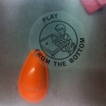
Instructions on the kids' play table in the waiting room.
Sadly, most children’s toys in waiting rooms are broken, and this one was too. I would dearly have loved to play with it because of it’s request that I “play from the bottom.” It’s a great reminder of three experience design issues:
- When designing experiences consider how the addition of elements that take your participants outside their normal spectrum of interactions can enhance what you’re making. Here, players manipulate objects by reaching under the table and using a magnet. The objects are sandwiched in a space between two sheets of plexiglass, so players can watch the results of their actions from the top. Normally, when we interact with object and tables, we do it from the top – but this presents a twist on expectations. It challenges players to interact in a non-standard way, producing new sensations. We enjoy the unexpected in small doses (note that small doses are relative to the person).
- Here’s the corollary to #1: When you decide to add elements that are non-intuitive or require interactions that your participants may not have encountered, you have to somehow communicate what’s expected. There are graceful ways to incorporate this information into the design, but sadly this table is a terrible example. The text and illustration are small. The primary players are likely to be too young to even read the message.*
- While you could argue that #2 also makes this table ‘broken’ – it was also literally broken when I encountered it. The magnet for use under the table was missing. The cable that had attached it to the corner of the table was still there, snaking uselessly down to the floor. The reminder here: design for time. Think about how many people will interact with this. How long will this thing that you’re making be around? How will it be maintained? If more people start to use it, or start to use it differently – will someone make changes to accommodate this? These all may seem obvious, but so often – especially when making digital things – the focus is simply on getting the thing out the door.
So there you have it, three examples of experience design considerations: one positive, two negative – all in one non-fuctional children’s play table in a waiting room.
* There are many great treatises on making these design decisions (i.e. how do you communicate how this object should be used?) – “The Design of Everyday Things” by Donald Norman is a great primer, but is nowhere near the last word on the topic.

