The alternate title to this post is: “Why QR Codes are like Animal Sponge Magic Capsules” – but I’ll get to that in a bit. If you know all of the reasons why QR codes are the devil’s work, and just want to know where the heck I’m going with this analogy, feel free to skip down to the fun part.
Quick Response codes, QR codes, the platform-crossing little blocks of black and white noise that we love to hate. Everyone’s favorite marketing tool and punching bag. But why do they persist? And why am I even bothering to devote these precious bytes to exploring them?
There’s the purely pragmatic part – the part that gets you to a URL or other digital information faster and more accurately than you could type it in yourself. As their detractors are quick to point out, this only really works well when the conditions are just right, ie: the viewer actually has a QR reader loaded on their smartphone (only 35% of Americans even have smartphones and many fewer of them actually have a QR reader loaded), they have enough time (and hands) available to get out their phone and open the QR reader app. (hello QR codes on billboards), and they actually have an Internet connection (in-flight magazines, I’m looking at you).

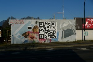
AUDREY - approx. 45' x 14' - Located on First Avenue at Nanaimo Street, Van., BC. Painted by Hi-Fi Murals, image via the Wooster Collective.
There are definitely some uses of QR codes that obey all of these conditions and add some extra value to the situation. There’s the mural in Vancouver created by Hi-Fi Murals that, instead of being repainted after being defaced by graffiti, was partially covered with a large QR code that linked to a pre-graffiti image of the work and further information. This actually used the anti-aesthetic nature of the QR code to advantage in order to call attention to the crime instead of covering it up.
Six to Start’s puzzle hunt for ‘Four Codes and Keys’ (Death Cab for Cutie’s latest album) built QR codes directly into the puzzles themselves. This was by design as the project not only promoted the album, but also eBay’s RedLaser barcode scanner. Possibly because of this promotional angle and the short development timeline, the project was somewhat fragmented as whole and certainly suffered from some of the standard QR no-nos (such as: don’t display a QR code on a screen to be scanned). There’s a lot that’s not subtle about ‘Four Codes’ but to dismiss it right away would be to ignore the work in the ‘Talking Bird” game. Here Six to Start turned a QR code into a sort of jigsaw puzzle and distributed the pieces over 12 separate twitter accounts. The tweets from these accounts, when taken in sum, formed a sort of logic puzzle that pointed to the correct placements of the QR puzzle pieces. This challenge is lovely, not because of the narrative between the twitter accounts (there isn’t really one) or because of any aesthetic successes (it’s pretty bare bones in the visuals department), but because it hits on one of the essentially attractive features of both QR codes and logic puzzles and mixes them together.
What feature is this? It’s what I think keeps us, as experience designers, coming back to QR codes despite how much we complain.
Remember those little pill-shaped capsules that you could drop into the sink or a bathtub and they would then expand into a spongy purple dinosaur or an orange monkey? They were utterly thrilling and surprising to watch transform from something vaguely medical-looking to a portal for your pre-adolescent imagination. And once you knew – once you’d been let in on the secret of those little pill-shaped capsules, you could make them change shape every time you encountered one– without being told how they worked. This still didn’t get you any closer to the secret of what they held inside just by looking at them, but now you had the key to finding out. You could make the magic happen because you knew the secret ingredient.
Here’s what I’m proposing: as makers and designers of experiences, we’re drawn to QR codes because they offer the same thing those spongy capsules did for us as children. The same thing that Mad Magazine Fold-ins did for us as adolescents. They give us both the locked door and teach us very quickly how to use the lock picking set so that we can reveal what’s on the other side. And that’s a powerful combination.
That combination generates the feeling of agency. Note I didn’t say actual agency, just the perception of it. But many times, that’s plenty. When passers-by use the QR code on the wall to see how the mural looked before it was vandalized, they get to repaint the mural themselves. Instead of the artist repainting the mural once, the mural gets repainted by every person who scans the QR code.
Now, am I saying QR codes are the best way to create this sensation? Absolutely not. But I think they provide a great model to for designers to consider: how do we present the lock, where do we put the lock-picking tools, and how do we teach our participants to pick the lock?


